Nassos Stylianou
Visual stories reporter at the Financial Times. I specialise in finding stories from complex datasets and visualising them in clear and compelling ways. Previously dataviz analyst at Global Energy Monitor. Before that, I worked as a senior data journalist at BBC News, where I was editorial lead on a number of the most successful and impactful BBC projects. My work often included complicated data analysis and used innovative storytelling formats and techniques, receiving recognition at prestigious industry awards.
Feel free to contact me by email on [email protected] or via any of the social media platforms below.
Rise of the mega battery
October 2025, Financial Times

How mega batteries are unlocking an energy revolution: Massive shipping containers full of powerful batteries are shoring up grids and extending the use of clean power.
Things I did: Story idea and research, conducted interviews and reporting, sourced and analysed data using Python and R and worked with colleagues to produce dataviz.
Link to story
The football game
August 2025, Financial Times

Can you run a Premier League football club? FT game puts readers in charge of a fictional football club, tasked with balancing the books and delivering on the pitch.
Things I did: Story concept and research, collaborating closely with external experts and team members on the game format, structure, data, content and functionality.
Link to story
The AI race
July-August 2025, Financial Times

Inside the relentless race for AI capacity: The quest for superintelligence is spurring a data centre boom, but critics question the environmental impact, soaring costs and whether it is all needed.
Things I did: Involved in a three-part FT series exploring the race for AI capacity and the data centres at the heart of billions of dollars in capital investment, leading the first story and carrying out research, data analysis and graphics for the second one.
Link to story 1 | Link to story 2
Detention dollars
July 2025, Financial Times

Inside America’s booming immigration detention industry: A visual investigation into the enormous US deportation programme that is enriching companies as detainees complain of poor treatment.
Things I did: Carried out extensive data analysis on US detention statistics, using a range of datasets to identify trends and top lines in the data as well as establishing the methodology. Combined with colleagues on reporting and dataviz.
Link to story
The making of an 'electrostate'
May 2025, Financial Times

Data-rich deep dive on how China is on course to becoming the world's first major 'electrostate', rapidly electrifying an economy increasingly driven by clean technologies.
Things I did: Story concept and research; sourced and analysed data using R, contributed to dataviz presentation as well as conducting interviews and reporting.
Link to story
Why Trump can’t build iPhones in the US
April 2025, Financial Times

The Trump administration wants the iPhone to be m in America. A detailed look inside the world’s most popular smartphone illustrates why that is highly impractical.
Things I did: Worked on story concept with colleagues; collated and analysed data on Apple’s suppliers and accounts, contributed to dataviz and visual story presentation.
Link to story
China's trillion dollar trade surplus
April 2025, Financial Times

China’s record trade surplus lit the fuse on Trump’s tariff war and fuelled fears among many countries about their industries being crushed by Beijing’s export dominance. Visual story on how China’s trade juggernaut is built on deep competitive advantages.
Things I did: Developed story concept, working with FT reporters in China on research and reporting. Sourced and analysed trade and battery data, prototyped dataviz using R and Illustrator, involved in all stages of story and graphics production.
Link to story
Are you ready to go electric?
January 2025, Financial Times

Petrol cars are on the way out: The UK government wants 80% of new cars to be electric by 2030, but upfront prices, charging availability, range and running costs worry consumers. The imaginary town of Greenwell outlines how to tackle these issues.
Things I did: Assisted colleagues on project concept, story planning and reporting. Worked with industry experts to gather and analyse data on EV range and UK charging infrastructure, producing charts and maps using Flourish, R and Illustrator.
Link to story
China's renewables rollout
July 2024, Global Energy Monitor
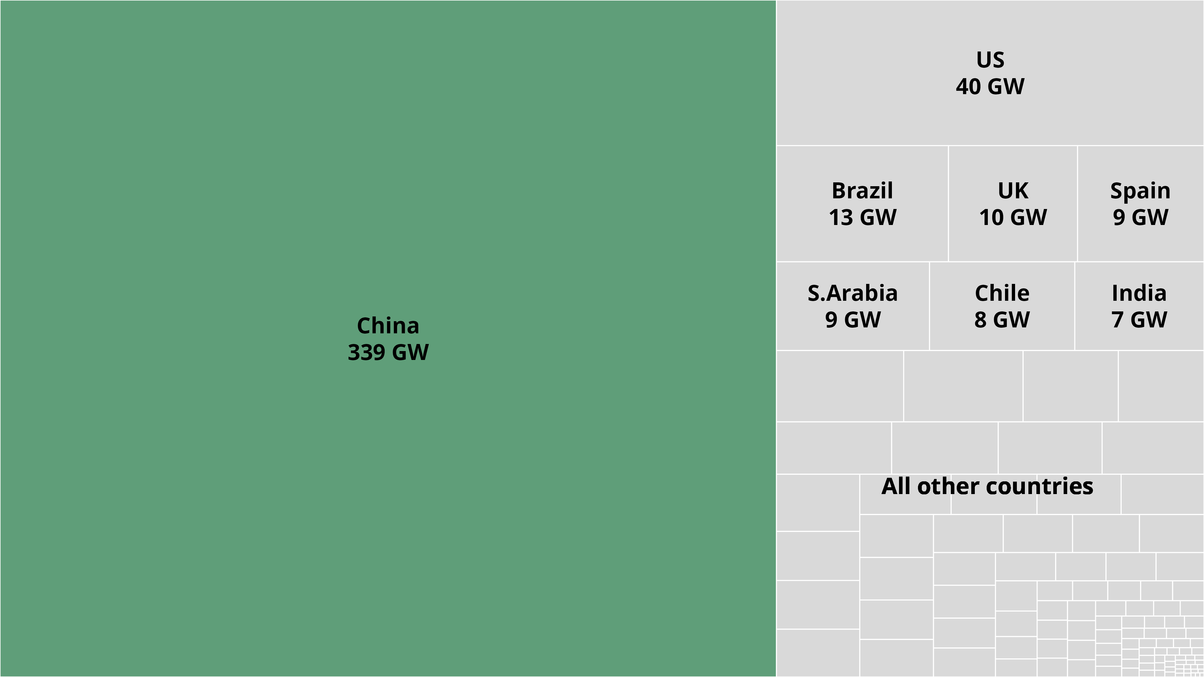
China is building two-thirds of the world's solar and wind power projects, according to analysis of Global Energy Monitor data. Story picked up by multiple news organisations including The Guardian, Reuters and the BBC.
Things I did: Worked alongside analysts at the organisation to find the clearest trends and narratives from the latest wind and solar power data, as well as producing data visualisations for the page.
Link to story
Boom & bust coal
April 2024, Global Energy Monitor
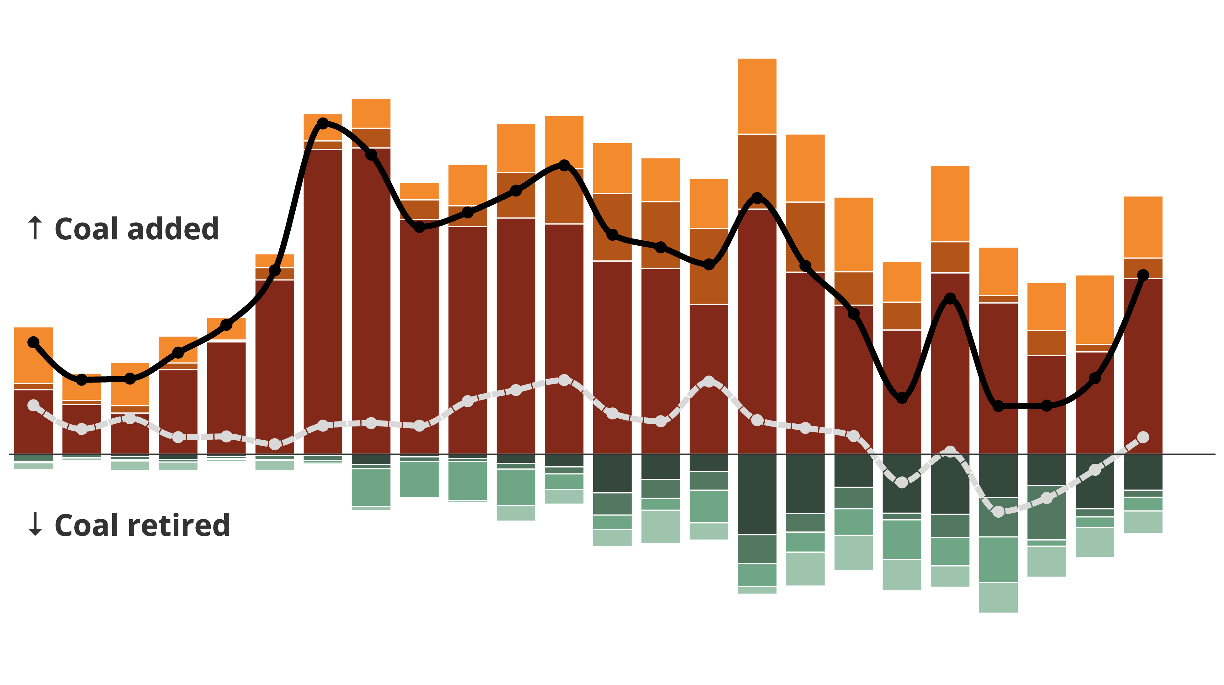
Tracking the global coal fleet: Global Energy Monitor report reveals rise in global coal capacity driven by new builds in China and a slowdown in closures. Coverage in major news media such as the Financial Times, Bloomberg and the NYT.
Things I did: Collaborated with colleagues to identify storylines from the data, led on dataviz production for the story as well as worked with reporters at major media organisations to cover the research.
Link to story
Dashboard revamp
2024, Global Energy Monitor
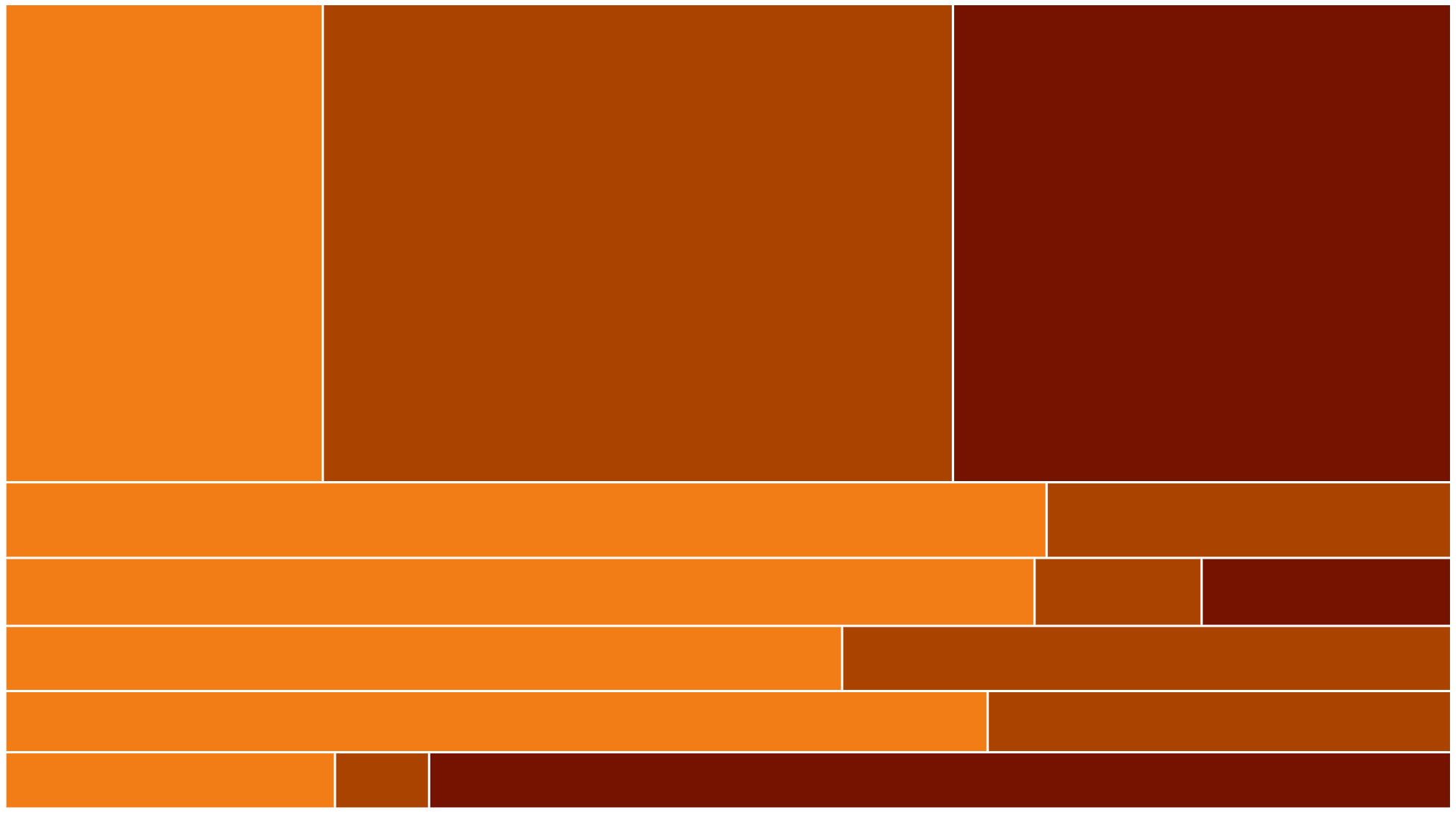
Led a major revamp of Global Energy Monitor's interactive data dashboards across a number of power trackers, prioritising an improved editorial offering, a better and more responsive design, and an enhanced user experience.
Things I did: Developed a new framework and template for creating and updating dashboards at the organisation, leading the work from concept to completion. Used the Flourish API, Heroku and Github to set up the new process.
Link to dashboard
Creating GEM's dataviz style
January 2024, Global Energy Monitor
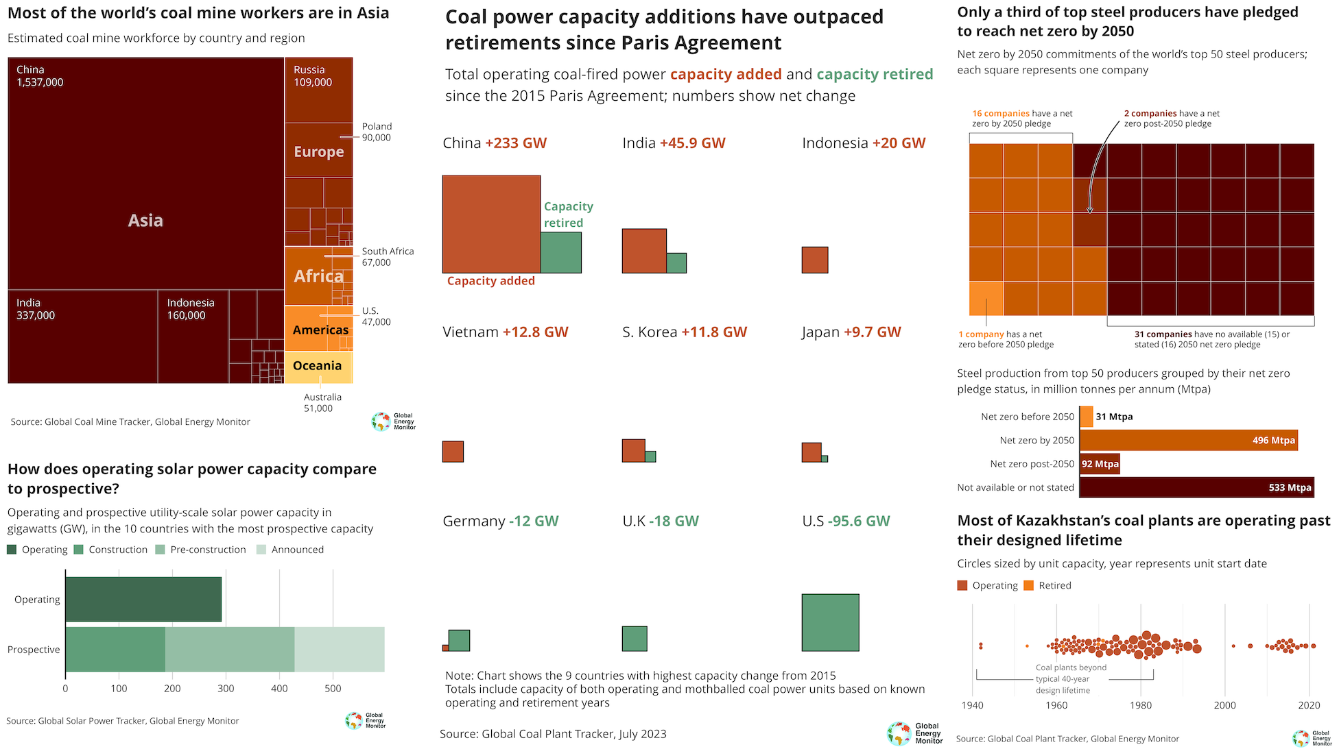
Developed a dataviz style guide for Global Energy Monitor based on principles of good storytelling, design and accessibility. Created resources to enable colleagues to make high quality production-ready dataviz in organisation's style.
Things I did: Created dataviz guide from scratch, producing resources such as chart templates, code examples, tutorials, and more. Implemented across organisation and delivered training to guide colleagues through process.
Link to resource
Illegal sewage spills
September 2023, BBC News
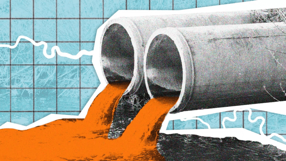
Data analysis by the BBC suggests that three major water companies illegally discharged sewage hundreds of times in 2022.
Things I did: Involved in the early stages of the project whilst still at the BBC. Wrote code in R and CDO to carry out initial data analysis of rainfall data, working with colleagues and academics to establish a robust data methodology.
Link to story
Who owns UK property?
February 2023, BBC News
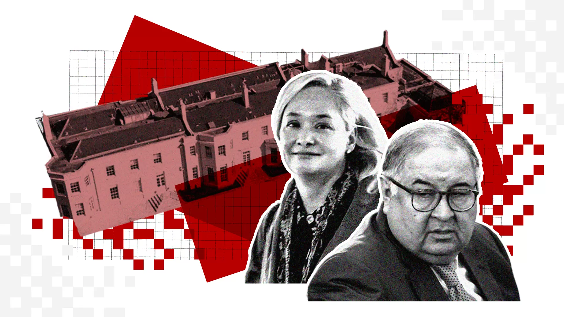
Owners of around 50,000 UK properties held by foreign companies remain hidden from public view, despite new transparency laws.
Things I did: Data wrangling and analysis in Python, working with colleagues and partners to quantify the effectiveness of new UK legislation. Carried out story planning, writing, reporting and production.
Link to story
Changing High Streets
December 2022, BBC News

How has your high street changed during the pandemic? BBC analysis of Ordnance Survey data reveals the changing face of the British high street from a place to buy things to a place to do stuff.
Things I did: Data analysis in R to find key storylines by identifying major trends and geographic patterns. Story production and planning, as well as creating detailed R Markdown reports shared with multiple BBC reporters.
Link to story
Record-breaking summer
October 2022, BBC News
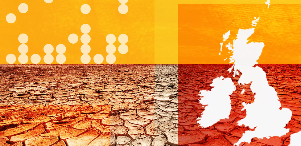
Dozens of temperature records smashed: Data analysis finds more than half the UK's oldest active weather stations recorded their hottest day ever during the unprecedented July 2022 heatwave.
Things I did: Coordinated with the Met Office to identify key trends from 2022 weather station data. Involved in all aspects of story production such as story planning, data analysis, writing and data visualisation.
Link to story
Exploiting UK secrecy loophole
August 2022, BBC News
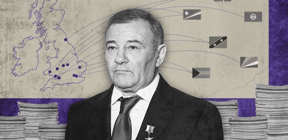
Banned Russian oligarchs exploited UK secrecy loophole: Uncovering evidence linking some English Limited Partnerships to fraud, terrorism and money laundering.
Things I did: Sourced and analysed data from Companies House to identify key trends. Did reporting and research on BBC story and collaborated closely with colleagues at Finance Uncovered to verify findings.
Link to story
Uber's dark tricks revealed
July 2022, BBC News

A global investigation revealing the dark tricks used by ride-hailing company Uber in its aggressive expansion, cosying up to world leaders and deceiving investigators.
Things I did: Investigative journalism, reporting and research for BBC Panorama film as well as working with colleagues to write and produce news stories and a longform feature article for the BBC News website.
Link to story
Oligarch property
April 2022, BBC News
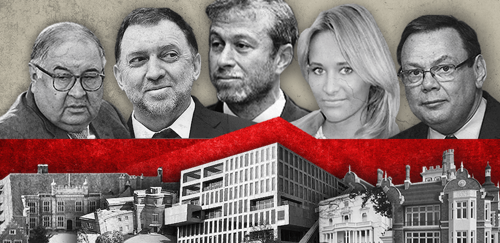
A detailed BBC analysis showing how a dozen sanctioned Russians are linked to an estimated £800m worth of property in the UK, including multi-million pound country manors and luxury flats in London's most expensive areas.
Things I did: Part of a team carrying out a detailed review of leaked offshore documents and Land Registry records. Worked with colleagues to write and produce feature story for the BBC News website.
Link to story
Pandora Papers Russia
April 2022, BBC News

Hidden wealth of one of Putin’s 'inner circle' revealed: Investigation that exposed how a sanctioned oligarch from Putin's "inner circle" hid his wealth, highlighting the obstacles impeding Western sanctions on Russian oligarchs.
Things I did: Investigative journalism, reporting and research. Trawled through and analysed company and financial documents as well as data from the land registries in the UK and France.
Link to story
Myanmar’s deadly battles
February 2022, BBC News
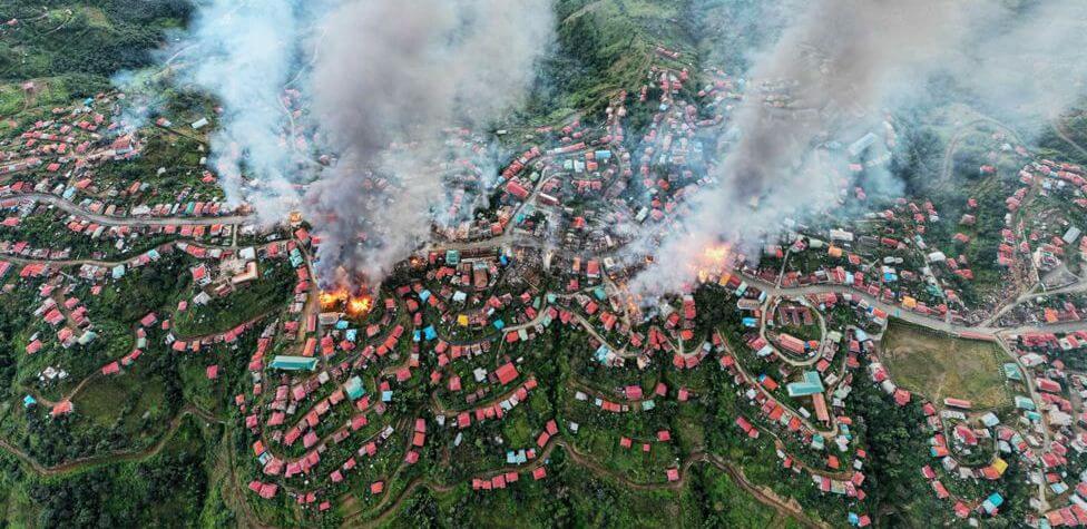
The deadly battles that tipped Myanmar into civil war: BBC data analysis reveals how Myanmar has seen increasingly deadly battles between its military and organised groups of armed civilians, while the nature of the fighting points to a change in the conflict from an uprising to a civil war.
Things I did: Data analysis, visualisation, reporting. Used R for both the data analysis and visualisations, spoke with experts to understand the nature of the conflicts and the recent trends.
Link to story
Channel crossing tragedy
December 2021, BBC News
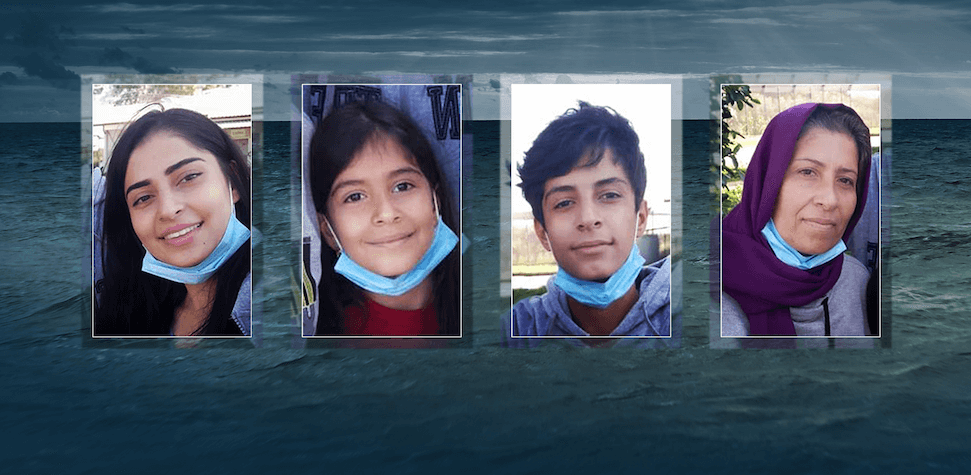
The terrifying final hours of their fatal journey: Visually engaging story that pieces together the final hours of a group of around 30 people who lost their lives crossing the English Channel - through survivors’ testimony, mobile phone messages, shipping data and the emergency response.
Things I did: Wrote code in Google Earth Engine to process satellite imagery of the English Channel, working with colleagues to produce the scrolly map element of the story.
Link to story
Secret UK property owners
October 2021, BBC News
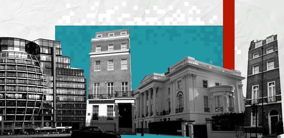
Secret owners of UK property worth billions: Revealing the high-profile foreign politicians, UK political donors and individuals accused of corruption secretly owning property in England via offshore firms. Investigation was part of large global ICIJ Pandora Papers collaboration.
Things I did: Part of the Pandora Papers reporting team that programatically cross-referenced UK Land Registry data on properties held by firms based abroad with leaked company ownership documents to identify matches.
Link to story
Life at 50C
September 2021, BBC News
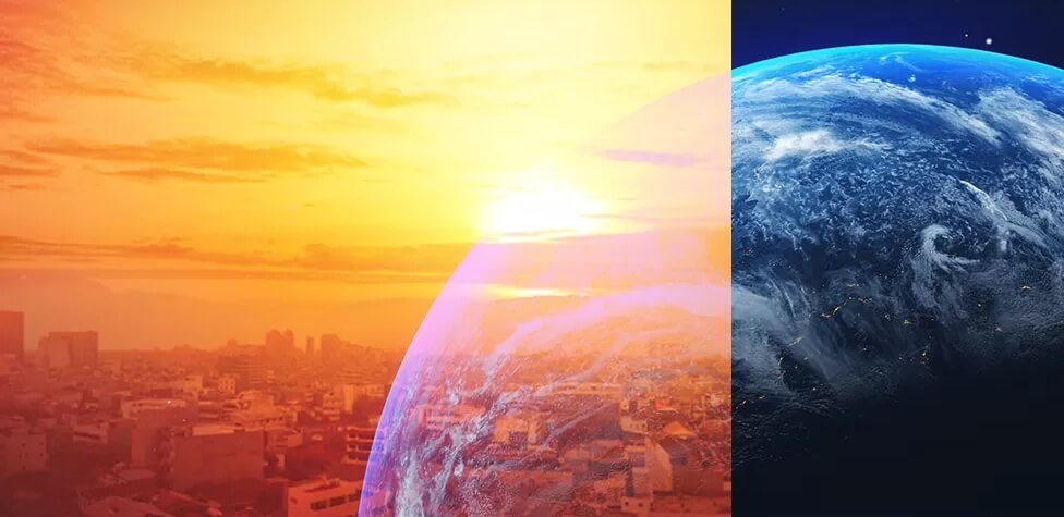
World now sees twice as many days over 50C: BBC analysis of global climate data found that the number of extremely hot days every year when the temperature reaches 50C has doubled since the 1980s. The story launched the Life at 50C documentary series.
Things I did: Analysed billions of hourly climate records using advanced statistical techniques, collaborating with climate scientists on methodology. Used Python and R. Worked with colleagues to write story and visualise findings.
Link to story
Climate change near you
December 2020, BBC News
How high might temperatures rise where you live - and is it likely to rain more? The most detailed project accessible to the public showing the potential impacts of climate change at a local level in the UK. Received a Royal Statistical Society award.
Things I did: Story concept, project management, running complex data analysis that involved complicated climate and geospatial datasets. Collaborated closely with Met Office scientists and the BBC Panorama team.
Link to story
The true death toll of the pandemic
June 2020, BBC News
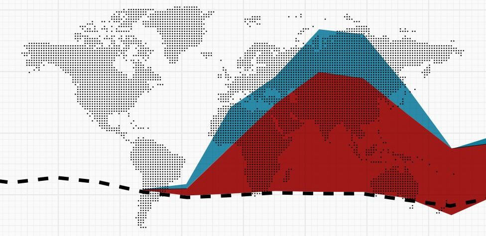
Far more people have died during the coronavirus pandemic than official Covid-19 data can account for. A review of mortality data in 27 countries and personal stories highlighting the tragic consequences.
Things I did: Story concept and research; collected, cleaned and analysed data for half the countries in the project. Wrote summaries for each of those countries and created graphics and analysis for BBC colleagues.
Link to story
Tracking the pandemic
March 2020, BBC News

Coronavirus cases, deaths, vaccinations by country: A comprehensive picture of covid-19 around the world. Key stories from an ever-changing pandemic told with data and visuals.
Things I did:
Processed, structured and analysed hundreds of thousands of data points from multiple sources, setting up a smooth process to update page daily and produce graphics, all done in R. Supported BBC correspondents with their reporting on the pandemic.
Link to story
Covid-19 in your area
March 2020, BBC News
Find out how the pandemic has affected your area in the UK. Brings together data on cases, deaths, hospitalisations and vaccinations, all explained. Most viewed webpage ever produced by BBC News.
Things I did: Processed, cleaned and analysed the UK's coronavirus data using R, producing graphics for the website and TV news bulletins. Helped colleagues bringing together multiple data sources used to update page daily, ensuring accurate reporting of covid-19 stats.
Link to story
Summer temperature records
October 2019, BBC News

Hundreds of temperature records broken over summer: An analysis of temperatures show that 400 all-time record highs were set in the northern hemisphere over the 2019 summer months.
Things I did: Story planning, data analysis, writing and reporting. Coordinated with climate scientists who provided data and did some data analysis to identify toplines for the story.
Link to story
How much warmer is your city?
July 2019, BBC News
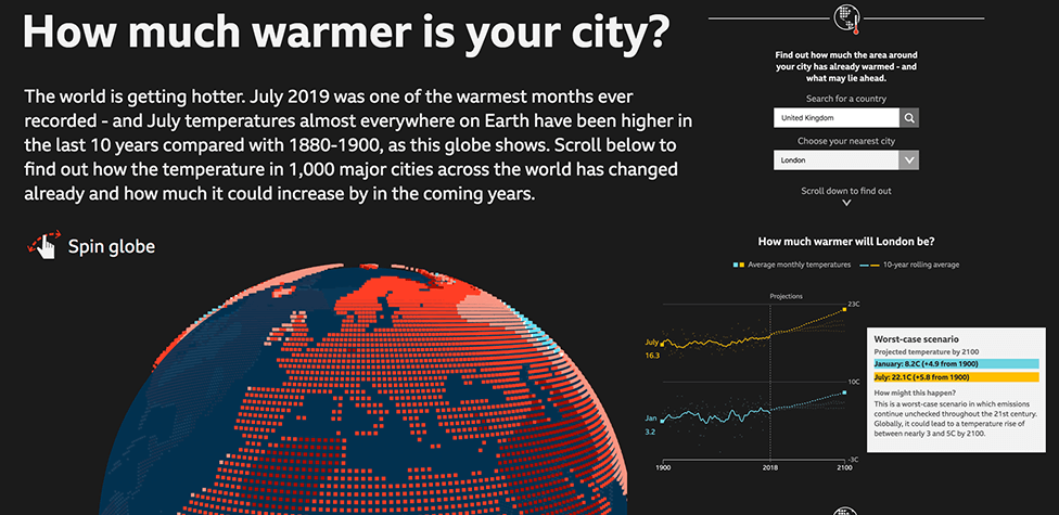
The world is getting warmer: Find out how the temperature in 1,000 major cities across the world has changed already and how much it could increase by in the coming years. Received a European Digital Media award.
Things I did: Story concept, production, reporting and led complex data analysis that involved working with three different large climate datasets. Appeared on BBC News channel to discuss story.
Link to story
Falling through the gap
April 2019, BBC News

Falling through the gender pay gap: A 'scrollytelling' experience showing how the gender pay gap measures up at more than 10,000 companies in the UK, with animations and visualisations changing on scroll.
Things I did: Contributed to the data analysis and visualisation of the BBC data team reporting of gender pay gap results, using R, and worked on the production of this particular page.
Link to story
Making BBC graphics
February 2019, BBC News
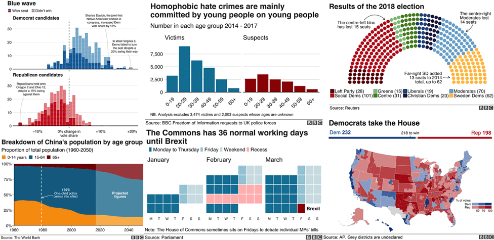
The BBC's R package and cookbook for making graphics: The BBC data team open sourced the code we use for making static visualisations, as well as publishing sample code and how-tos.
Things I did: Played a leading role in writing the code for the R package and cookbook, as well as documenting the process and sharing what we learnt. Also developed the internal R course described in the post.
Link to story
A green diet?
December 2018, BBC News

What's your diet's carbon footprint? Food production is responsible for a quarter of all greenhouse gas emissions. We looked at the impact of what you eat and drink on the climate.
Things I did: Developed idea, project management and development, data wrangling and analysis using R, writing and reporting the story and worked with colleagues on the visualisations produced for the page.
Link to story
Mapping the midterms
November 2018, BBC News
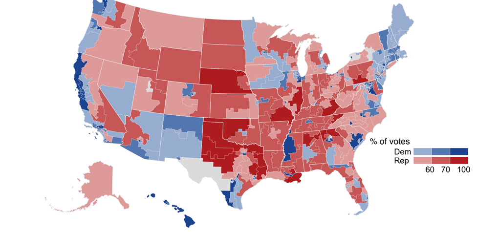
Mapping the 2018 US midterm elections: A BBC data team analysis of a dramatic election night, visualising how the political geography in the US has shifted and what this means.
Things I did: Worked with colleagues to prepare R scripts for generating election graphics, cleaning and interprating election data as well as writing and reporting on the day.
Link to story
Mapping London
October 2018
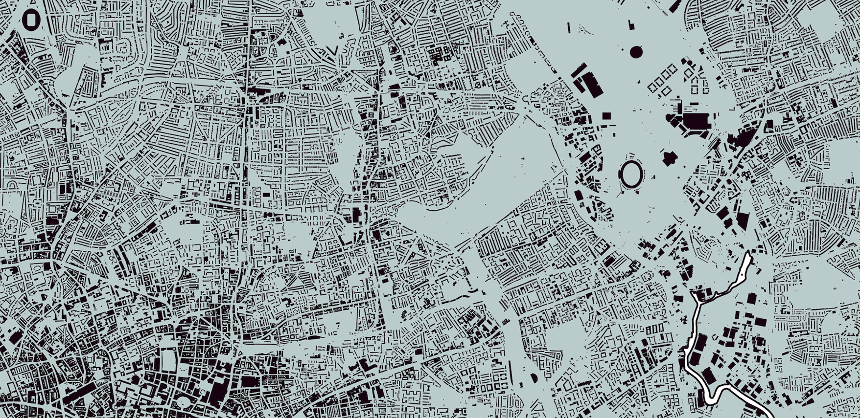
Inspired by some beautiful New York Times maps of the USA visualising urban footprints, I made some maps of London, one showing its buildings and the other its green spaces.
Things I did: Styled up and visualised geographical data for every building in London using mapping software QGIS, exporting the map in high resolution for printing.
Link to download full-resolution maps
Affordable rent?
October 2018, BBC News
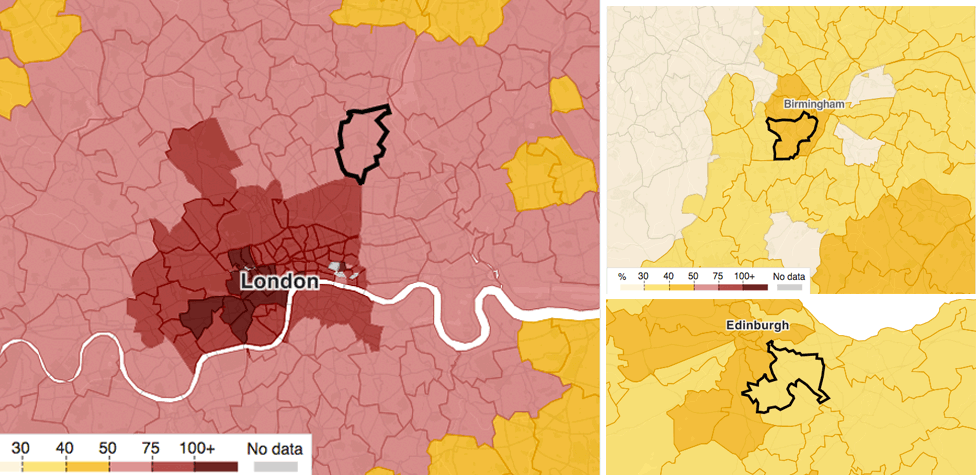
Where does rent hit young people the hardest in Britain? Looked at where people in their 20s who face paying more than a third of their salary to rent a place for themselves.
Things I did: Worked on the interactive map, doing the technical work to generate a BBC-style mapping tile basemap from the Ordnance Survey's map data.
Link to story
Syria's chemical war
October 2018, BBC News
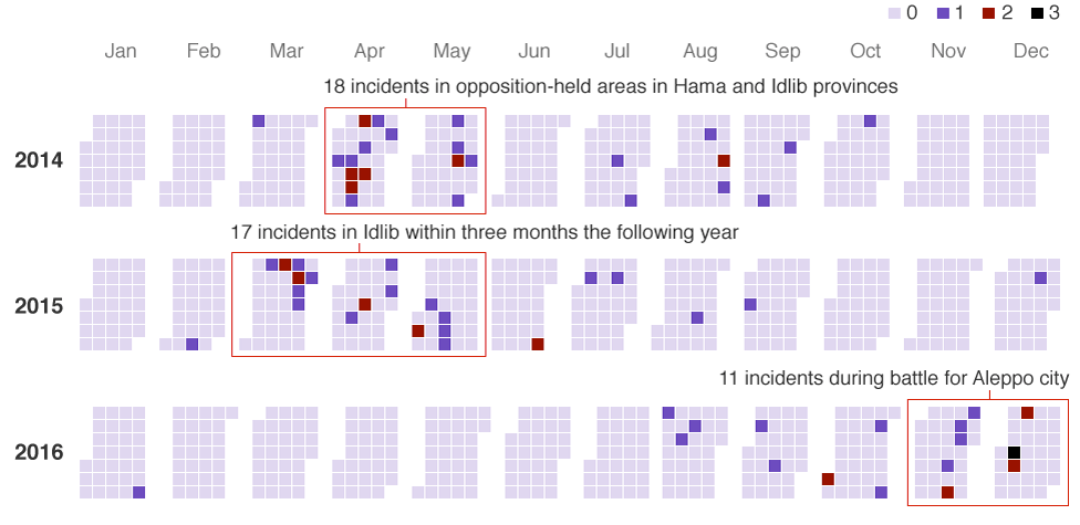
How chemical weapons have helped bring Assad close to victory: A joint BBC Panorama and BBC Arabic investigation on how chemical weapons have been used in Syria's war.
Things I did: Worked on the interactive map and the timeline calendar graphic in this story. Used Excel to clean data, Carto for the animated map and d3.js for the calendar visualisation.
Link to story
Mapping hurricane Florence
September 2018, BBC News
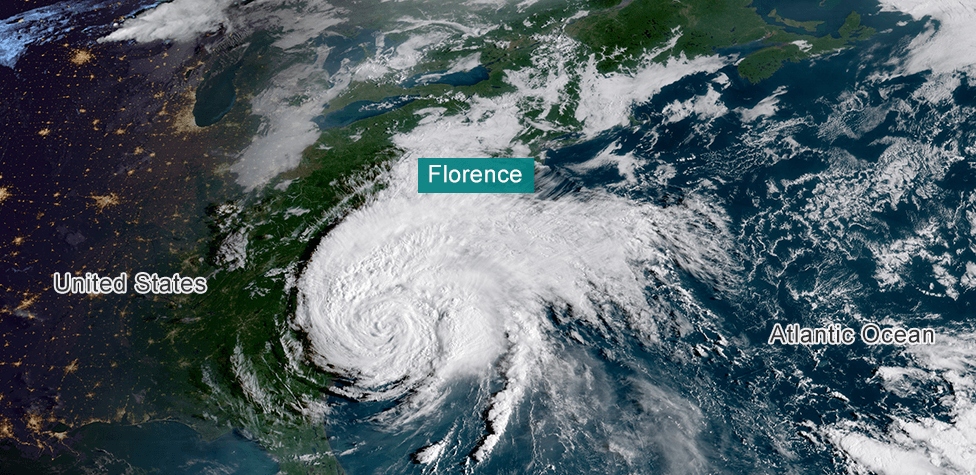
As hurricane Florence bore down on the East coast of the United States, we visualised the storm's predicted path and its expected rainfall, using maps and satellite imagery to tell the story.
Things I did: Wrote an R script to automate the download of high resolution GOES satellite imagery, used in the story and to create an animation. Used QGIS to produce a map of projected rainfall.
Link to story
World Cup penalties
July 2018, BBC News
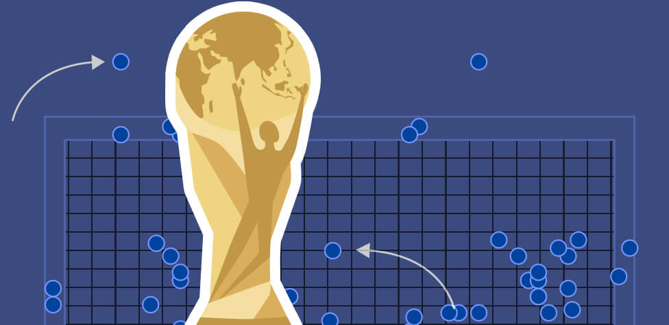
All you need to know about penalty shootouts: What makes the perfect kick? Who has the best record? And does luck really come into it? We visualised the history of World Cup shootouts.
Things I did: Analysed penalty shootout data from Opta, wrote and produced the story and created all the graphics using R and ggplot2 from start to finish.
Link to story
World Cup in charts
July 2018, BBC News
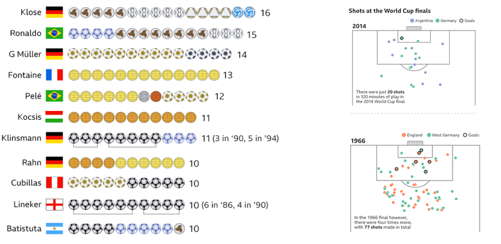
How important is home advantage? Which Mexican defender has the same World Cup scoring record as Cristiano Ronaldo? Seven data visualisations about the World Cup.
Things I did: Story idea and planning and managed the project editorially. Analysed and visualised World Cup data in R, using the ggsoccer package to create the shot maps.
Link to story
Living longer
May 2018, BBC News

Nine facts about how long we live: Women outlive men in 195 countries and in Russia they do so by 11 years. Ethiopians are living 19 years longer than in 1990. Our story in charts.
Things I did: Data analysis, story planning and production, project management and coordinating with the BBC's language services and creating graphics from start to finish in R using ggplot2.
Link to story
Millionaire row
April 2018, BBC News
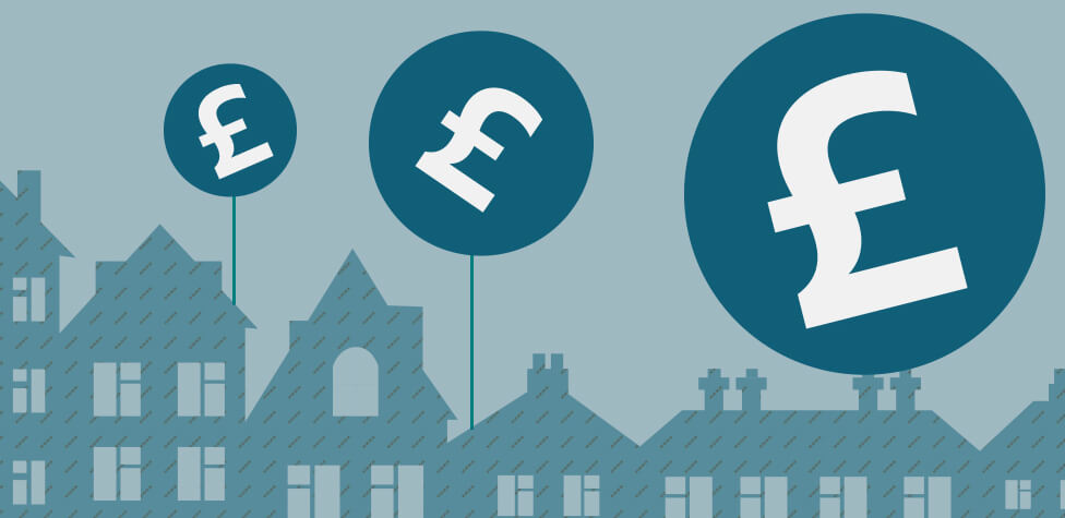
How many £1m-plus homes are sold near you?: We look at the areas in England and Wales with most residential property sales for £1m or more in the past decade.
Things I did: Came up with the story idea and concept and carried out some data analysis. Worked with colleagues to develop a new type of interactive search module for the story.
Link to story
Appy Helper
February 2018, BBC News
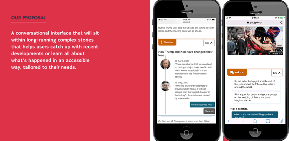
Explaining complex news stories to less engaged audiences. Part of a BBC team that won the "World Cup of Newsroom Innovation" with 'Appy Helper', an in-article chatbot to help readers.
Things I did: Editorial lead of winning team at the Global Editors Network hackathon. Our prototype was developed into a BBC product and featured in numerous stories.
Link to Nieman Lab article
Offshore Britain
January 2018, BBC News
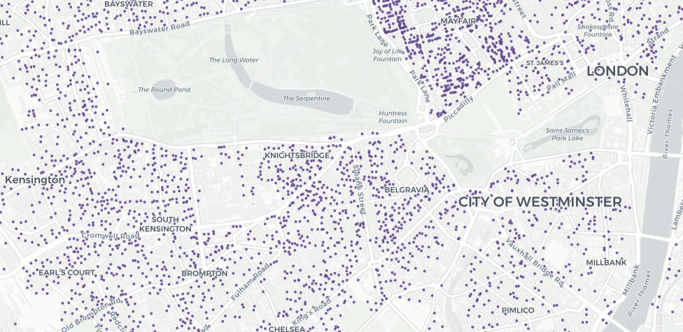
How much property is owned offshore? Investigation into UK property owned overseas, highlighting concerns that companies registered in British-controlled tax havens are used to avoid tax.
Things I did: Story idea and planning. Wrote R scripts to clean and analyse the data, as well as geocoding the locations to build an interactive map.
Link to story
A real recovery?
October 2017, BBC News

Have house prices actually gone up in your neighbourhood? Deep dive into house prices since the 2007 crisis, analysing 8 million transactions. Received a Royal Statistical Society award.
Things I did: Story planning, reporting, data analysis and production. Used R to clean and analyse a dataset containing all residential property transactions in England and Wales since 2007.
Link to story
What's left of Mosul?
August 2017, BBC News
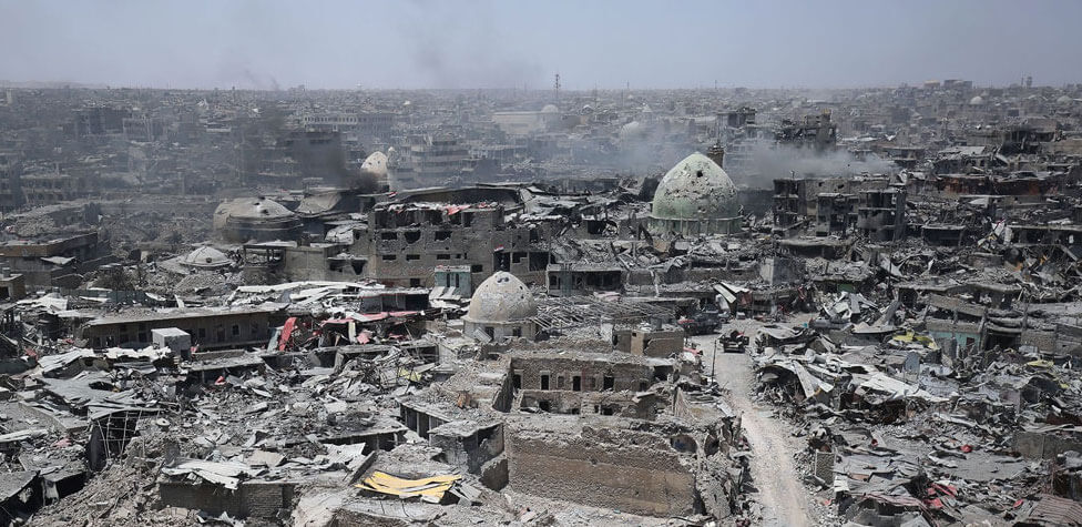
Is anything left of Mosul?: Collaborated with colleagues to show, using maps and graphics, the widespread destruction of the Iraqi city following the brutal fight against ISIS.
Things I did: Worked on the story concept and planning, collated data and carried out data analysis and some map-making. Used in-house map-making tools and QGIS.
Link to story
Coffee under threat
June 2017, BBC News

Will coffee taste worse as the planet warms? A feature examining the impact that climate change could have on coffee, both in terms of quality and price.
Things I did: Story planning, writing and reporting, data analysis, map-making and production. Used Excel, QGIS and processed Landsat satellite imagery using command line tools.
Link to story
Trump's wall
June 2017, BBC News
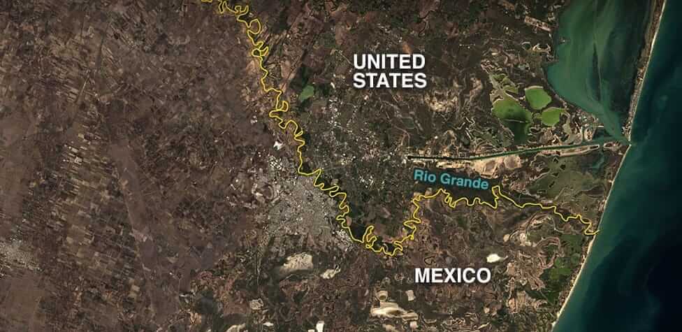
Six reasons Trump’s wall may not actually get built: Worked with a colleague to look at the obstacles President Trump will have to dodge to build a cross-country barrier.
Things I did: Data extraction, analysis and map-making. Used R to scrape online data, used QGIS and GDAL to make maps and processed Landsat satellite imagery with command line tools.
Link to story
Election results mapped
June 2017, BBC News
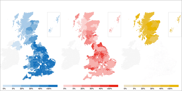
The 2017 UK general election in graphics: A BBC data team analysis of a stunning general election looking at how the UK's political geography has changed.
Things I did: Story planning, reporting, data analysis and map-making. Used R to write scripts to clean and analyse election result data and QGIS to produce maps.
Link to story
Olympic body match
August 2016, BBC News
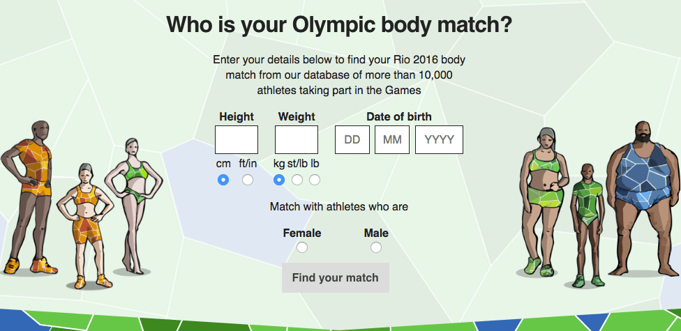
Who is your Olympic body match? Interactive calculator where by entering their height, weight and age, users can find out which athlete taking part in Rio 2016 they are most like.
Things I did: Story planning, editorial management and data analysis. Used R to write scripts to explore, query and test the Olympic athelete dataset.
Link to story
Buried without a name
May 2016, BBC News
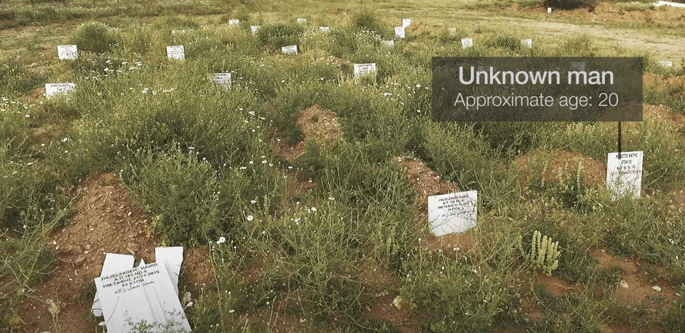
The untold story of Europe's drowned migrants: A BBC investigation quantifying the number of people who died crossing the Mediterranean and buried in unmarked graves.
Things I did: Story planning, reporting, data journalism, map-making and project management. Used Excel, QGIS, GDAL and processed Landsat satellite imagery using command line tools.
Link to story
Life in Syria
March 2016, BBC News
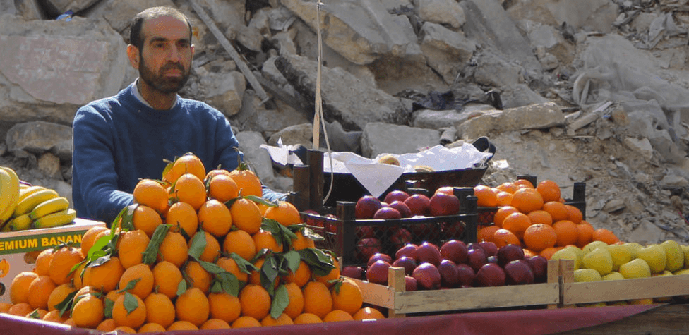
Life and death in Syria: What life is like for the millions who live in the country five years into a devastating war. Won best data vis at the European Digital Media Awards 2017.
Things I did: Story planning, reporting, data analysis and visualisation for two of the five sections of this story. Mainly used Excel for any data analysis.
Link to story
Will a robot take your job?
July 2015, BBC News
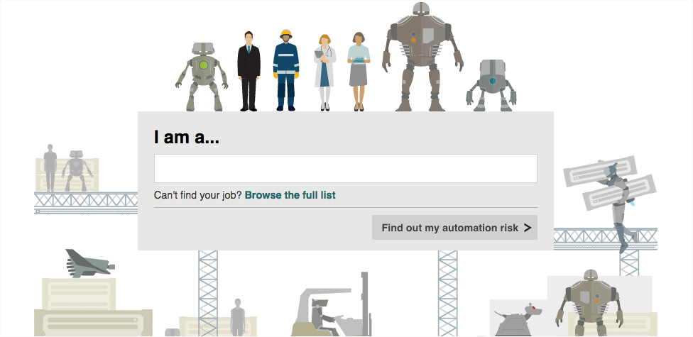
Interactive calculator where users can find out the likelihood of their job becoming automated. Project Featured in the 'Hello, Robot.' exhibition at the MAK museum in Vienna.
Things I did: Story planning, writing, data analysis and project management. Used a combination of Excel and R for data analysis.
Link to story
A Greek tragedy
July 2015, BBC News
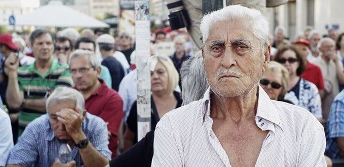
How bad are things for the people of Greece? Feature a colleague and I worked on looking at how the ongoing recession is affecting the lives of the people in Greece.
Things I did: Story planning, writing, reporting and interviewing, data analysis and visualisation.
Link to story
You vs Ronaldo
February 2015, BBC News
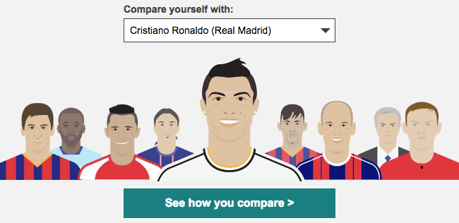
How long would it take to earn a footballer’s salary? Interactive page allowing users to compare their wages to those of global football stars. Won best data vis at the European Digital Media Awards 2016.
Things I did: Story planning, writing and reporting, data analysis, unit testing, project management.
Link to story
Mapping jihadist attacks
December 2014, BBC News
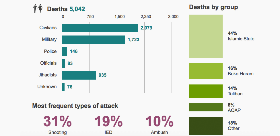
Tracking a month of deadly attacks: BBC and Kings College London investigation mapping jihadist attacks in November 2014. Project won the Royal Statistical Society best data visualisation award.
Things I did: Assisted senior journalist in the reporting, data journalism and map-making for this story. Used Excel and QGIS.
Link to story
Tracing patient zero
November 2014, BBC News
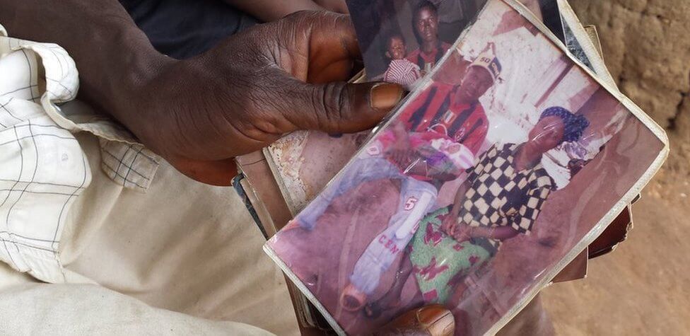
How world’s worst Ebola outbreak began with one boy’s death: Visually-led story on how the Ebola outbreak that ravaged West Africa in 2014 started and spread.
Things I did: Story planning, writing and reporting, data scraping, data cleaning and map-making. Used Excel, Tabula for PDF parsing, Open Refine for data cleaning and QGIS.
Link to story
A democratic deficit?
May 2014, Financial Times
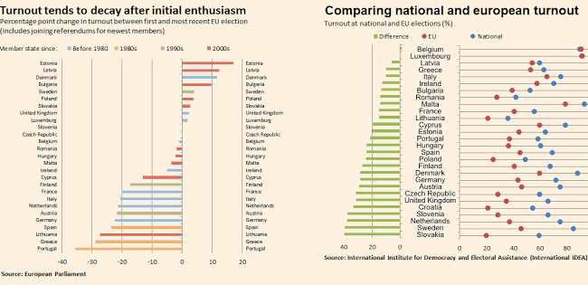
European Parliament’s turnout problem in 3 charts: A feature with the FT's senior data journalist examining the democratic deficit of European Parliament elections ahead of the May 2015 vote.
Things I did: Story planning, writing and data analysis. Mainly used Excel for analysis.
Link to story